End-to-End UX/UI, B2B, SaaS, Startup
2022
Sole UX Designer

PROJECT INFO
Summary
Made and Modern is a furniture manufacturing company. I was tasked with designing a communication portal that connects employees and clients. This platform enables seamless communication, document sharing, image annotation, and file uploads between the company and its clients.
Problem
Traditionally, the company communicates and connects with the customers through emails and phone calls for design orders. The company's current design ordering process is slow and inefficient, but loyal customers are unwilling to move away from familiar methods.
My Role
As the sole UX designer wore many hats. I helped the team as a UX researcher, UX writer, and graphic designer as well.
Outcome
120% increase in ordering speed
34% increase in reordering
15% decrease in customer call
RESEARCH METHOD
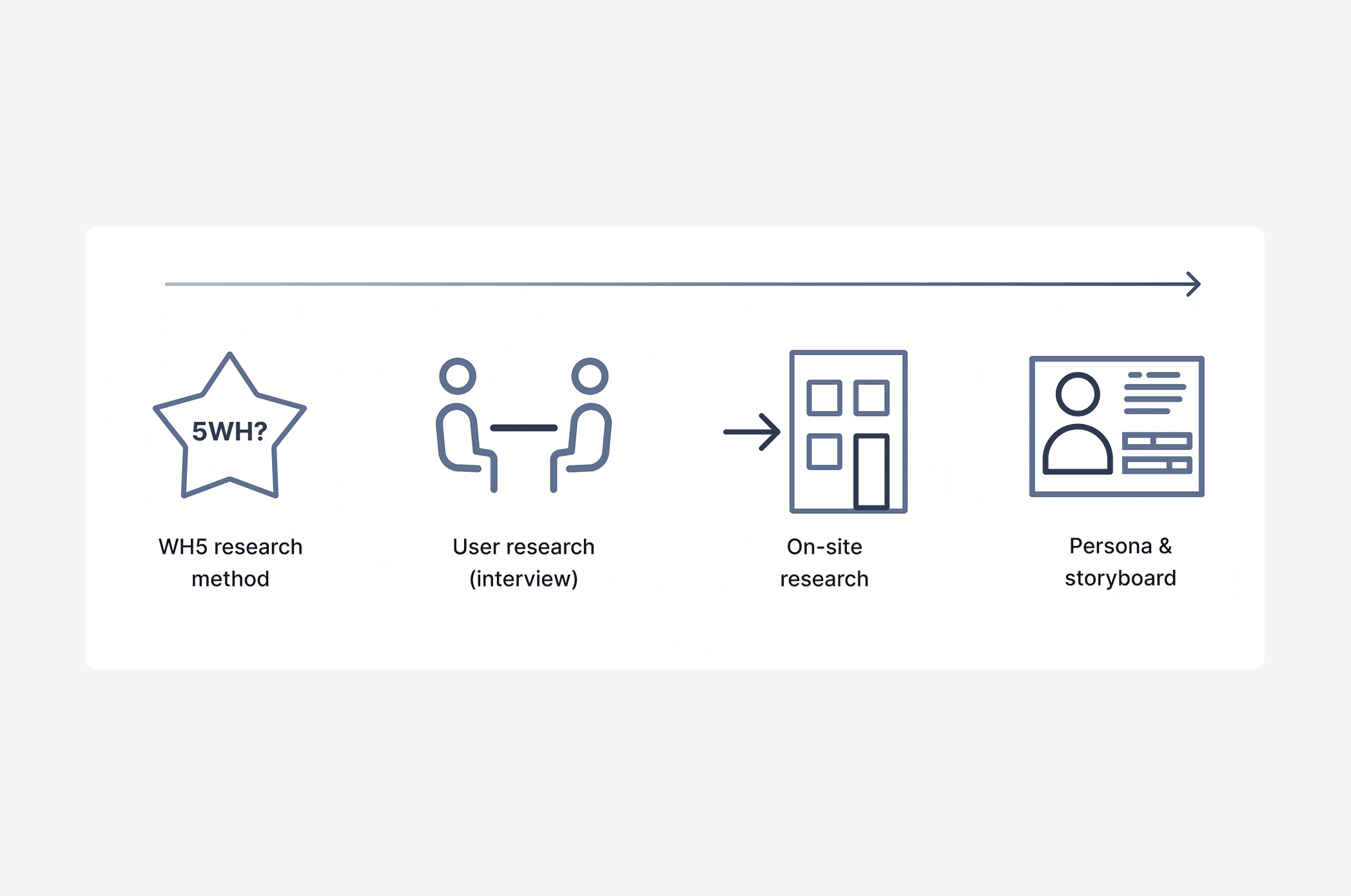
How did I uncover the user problems and gain insights into the business?
Understand the basics: First, I used the 5W method (who, what, where, when, why) to gather fundamental data about the problem and users.
Go deeper: I interviewed stakeholders and designers for specific insights into needs and challenges.
On-site research: I also visited the factory multiple times, talked to designers and clients, and witnessed the production process to gain a deeper understanding.


Key findings from the research with the solution
DESIGN SOLUTION
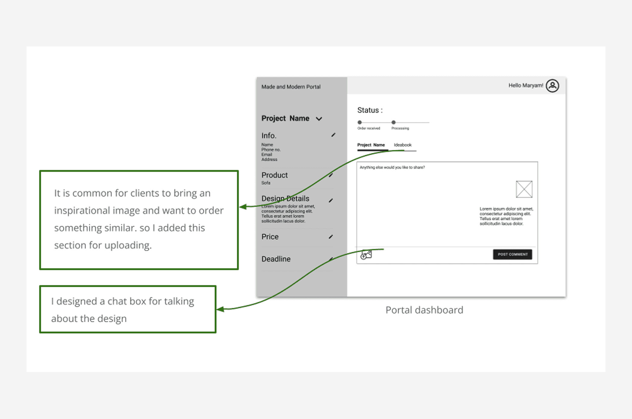
Once I felt confident in the insights gathered during my research, I began creating wireframes on paper. I referred to the data and photos I had collected in my notes to generate multiple design ideas to discuss with the team. After considering the pros and cons of each idea, we ultimately moved forward with one that we felt best addressed the needs and goals of our users.

As we approached the final stages of the design process, I created digital wireframes to visualize the layout, features, and flow of the product.
REFINE THE DESIGN
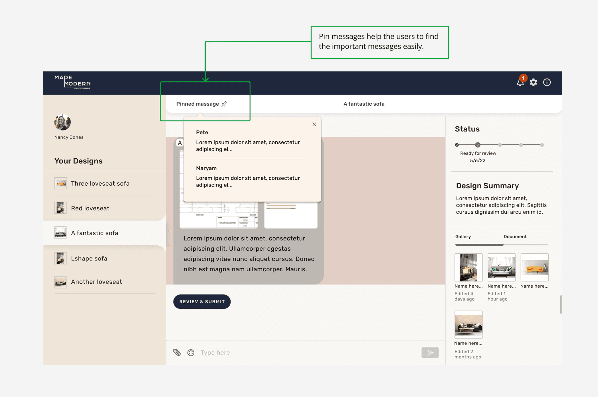
During the design process, I conducted numerous iterations and usability tests with users between the final design and the first hi-fi design. Additionally, I had design reviews with our business partners and received valuable feedback. Based on these meetings and my ongoing research, I made three significant changes to the dashboard design:
Uploading images should be very convenient as it is the main task users usually take.
I changed the layout to a three-column design. It helps the users to see all the information they need in front of their eyes.
During usability test with the M&M staff, I found how much it is important for the users to have a space to store all the documents. Therefore I made another section for Uploading PDFs.
FINAL DESIGN


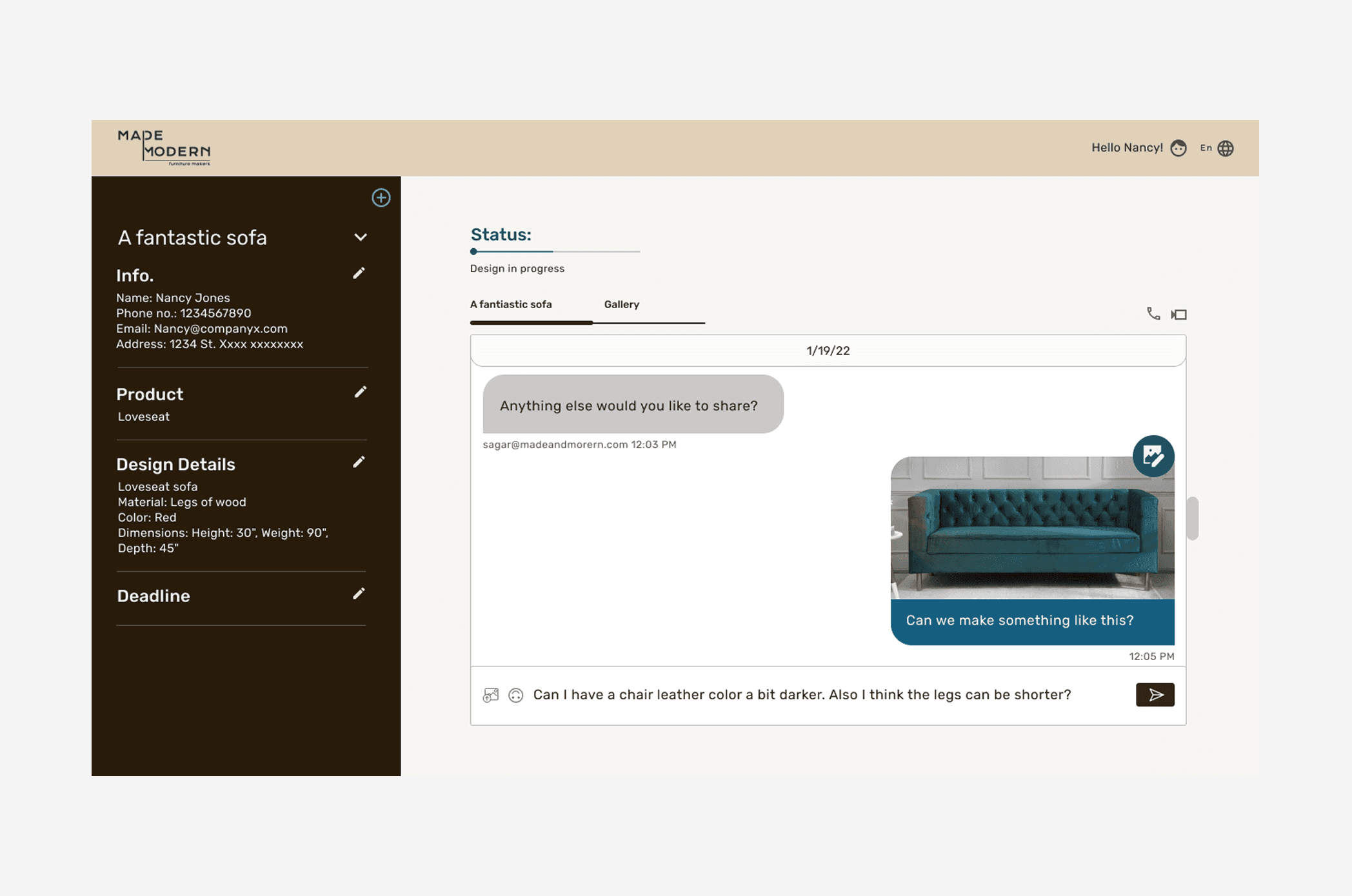
Dashboard (First version)

Annotation page (Frist version)

Annotation page (after)

TAKEAWAY
Improving my communication skills
During my experience working with the engineering team as the sole UX designer, I learned that effective communication is just as important as design itself. This experience forced me to improve my communication skills by clearly conveying my ideas to the team and presenting them directly to the CEO and founders.
Embracing the challenges
Working in a startup company presented me with many opportunities to experiment and make fast decisions on my own. Although I felt apprehensive at times about the impact of my decisions on the business, this challenge helped me grow and become more confident in my abilities. I learned that challenging yourself and taking risks is essential for personal and professional growth.