Building a calm, accessible healthcare shopping experience
Project Overview
Client: Molina Healthcare × Zenni Optical
Platform: Mobile-first web experience
Users: Low-income families accessing vision care
Timeline: 4 months
Role: Product Designer
Problem
Limited access, Too much choice, and Little room for error
From the initial research and stakeholder insights, it was clear that most users came from low-income families and had limited access to laptops. This made a mobile-first approach not just a design preference, but a necessity.
Users were purchasing medical eyewear, and since only the first pair was free, the experience was naturally high-stakes. Any confusion or mistake could lead to frustration, financial stress, or abandonment.
Through usability research, I found that users struggled most with the lens customization section. It offered too many options, relied heavily on text, and lacked clear visual guidance. Many users felt overwhelmed and unsure about their choices.
We also discovered that nearly 60% of returns were due to fit issues, meaning users were not confident that the glasses they selected would work for their faces.
This told us that clarity, visual guidance, and confidence-building needed to be central to the design.

Solution 1
Enhancing the experience through visual-first customization
Accessibility and clarity in the mobile shopping path were top priorities. The existing flow was text-heavy and lacked visual cues, which made it easy for users to get lost or misunderstand important steps.
Knowing that many users were not heavy readers and relied more on visual signals, I redesigned the customization experience to be visual-first and easier to scan. I introduced clear icons for:
Color
Frame shape
Gender selection
The new design is minimal, avoids overwhelming the user, and makes personalization feel simple and approachable rather than intimidating.

Solution 2
Bringing Virtual Try-On (VTO) to the front
Monthly customer service reports showed that nearly 60% of returns were caused by poor fit. Although the Virtual Try-On (VTO) feature already existed, many users missed it because of a weak visual hierarchy.
I moved VTO to the very beginning of the shopping path and placed it on a dedicated screen with no visual distractions. Users could clearly choose to try it or skip it.
This small change had a big impact:
It encouraged confidence
Reduced guesswork
Increased the chance of choosing the right size
Helped lower return rates

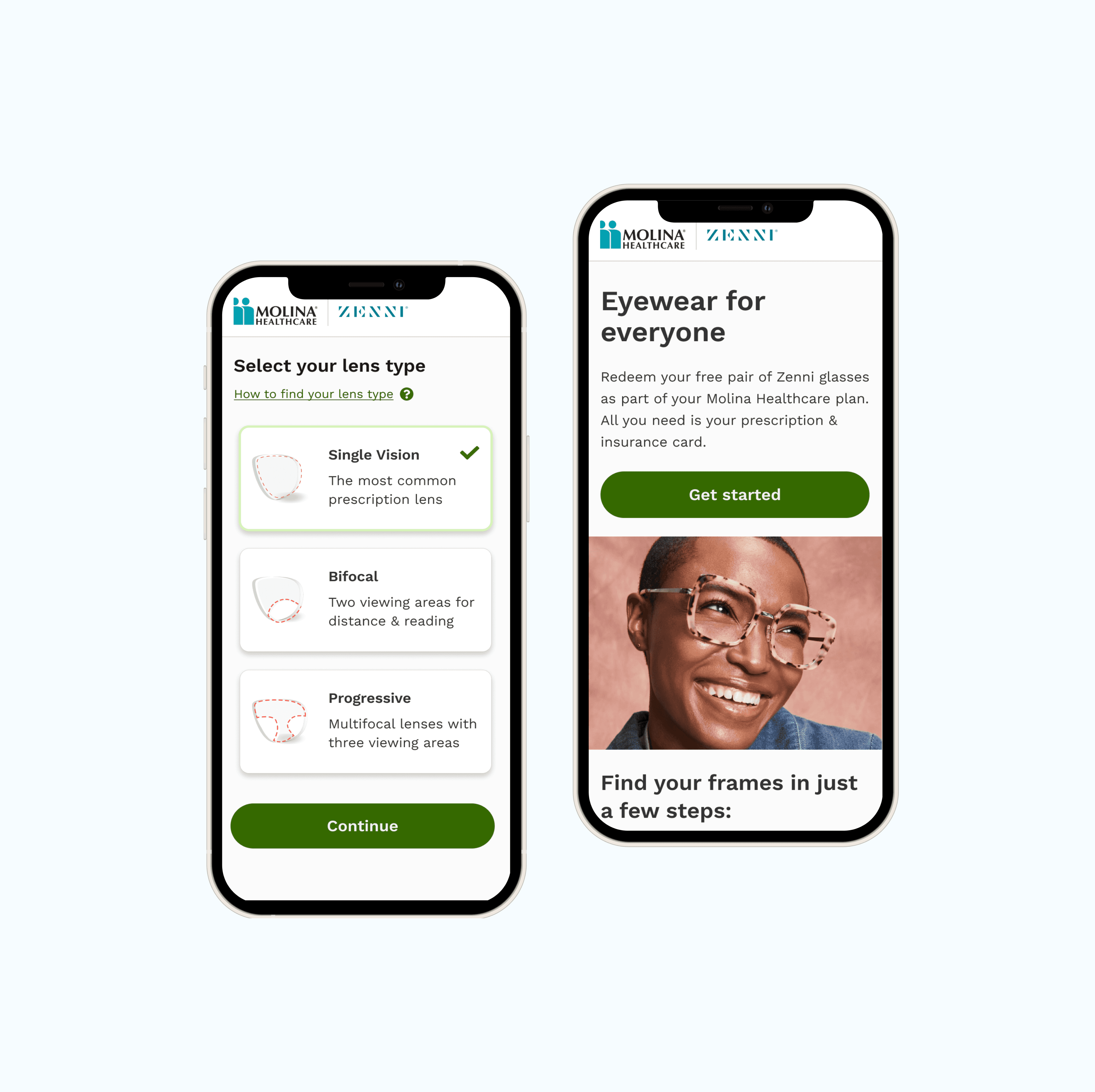
Solution 3
Simplifying the lens customization flow
In Zenni’s original flow, users selected a frame first and only later discovered whether it worked with their prescription. This often led to frustration when users reached the end and learned their lens wasn’t compatible.
In the new design, the experience starts with the lens.
Users select their prescription needs first, and the system then shows only frames that are compatible. This shift:
Removed unnecessary steps
Prevented disappointment
Made the flow faster and calmer
Built trust in the system

Outcome & Impact
We saw a 35% increase in engagement and a 20% improvement in conversion rate after the redesign.
But beyond the numbers, the experience became noticeably calmer and easier to understand.
That matters deeply in healthcare, where users are already under emotional and financial stress. The goal wasn’t just efficiency—it was reassurance.