Design System, UI/UX Component Library, Figma
2023
Product Designer

PROJECT INFO
Scope
Creating UI Component and updating My Account pages
Overview
As a UX Designer in the Design System team, part of my responsibilities was to create reusable components based on WCAG (Global accessibility standards) and implement the updated components in the pages. This project showcases my design contributions to updating Zenni's My Account pages. I created 50 components across 30 pages with a strong focus on accessibility, improving readability, and color contrasts for texts and buttons.
My Role
I led the design for 1 month.
Outcome
Reduced revisions and inconsistency-related bug fixes in QA audits.
DESIGN
List of the changes
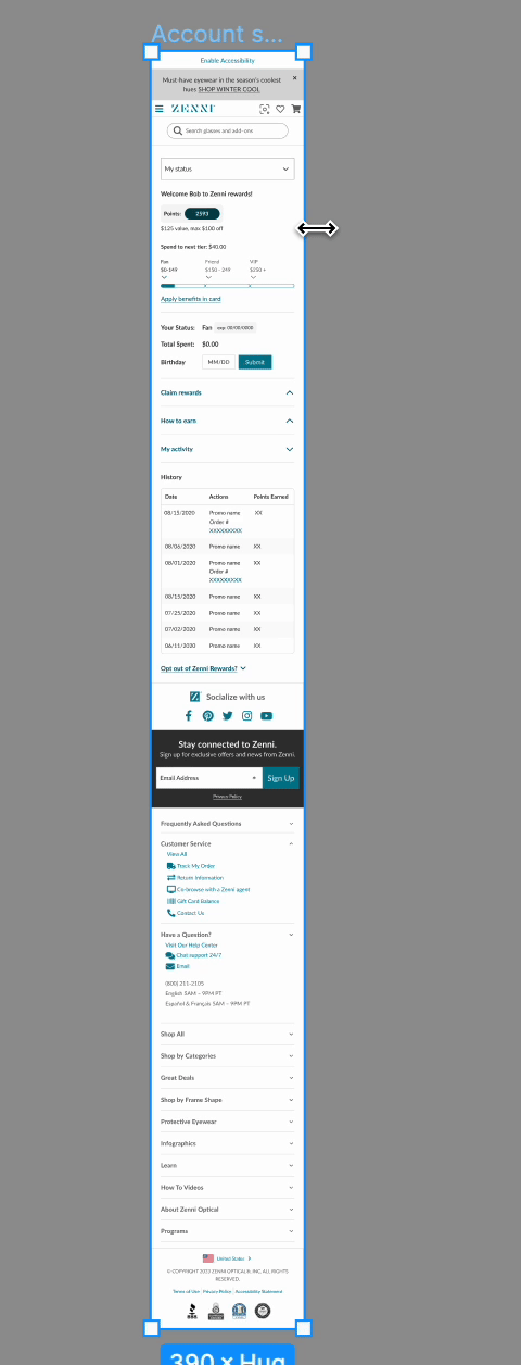
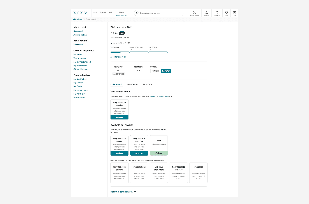
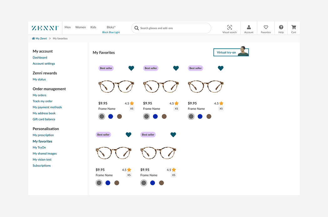
Updated the UI for large (1440) and small (390) breakpoints.
Adjusted layout to be multiples of 8.
Updated colors and fonts.
Improved the hierarchy and visual weight of elements. I got rid of the teal color as much as possible to have a more minimal design.
Made minor UX enhancements with minimal development effort.

KEY FEATURE 1
While I kept the teal color as the Zenni brand color, I minimized its usage for dividing lines to achieve a minimal and desirable UI.
KEY FEATURE 2
I updated the product details to give the user more info.
KEY FEATURE 3
I Improved the visibility of the important links by changing them to the primary buttons.

Figma File
TAKEAWAY
A design system is like a library—people with different needs and interests come in, and they need to find the right 'book' quickly and easily. For that to happen, the system must be well-organized, detailed, and easy to navigate. It’s a self-guided experience that relies on clarity and structure. While creating individual components was one part of the process, building the entire system itself became an exciting and valuable learning experience for me.